Service
UX Research
UX/UI Design
Branding

Service
Client
Year
During my UX/UI Design course at Ironhack, I co-designed Bluntly, a wellness app helping cannabis users track consumption, manage anxiety, and reflect through journaling. The project was built in 4 weeks and delivered as a high-fidelity prototype. We framed our design with macro-trends — the global cannabis market projected to grow 24.3% annually (2022–2027) and mHealth apps generating $8.2B revenue — and validated our concept through 61 survey responses and 5 user interviews. Insights showed that 45.9% of users don’t track consumption and 26.7% reported negative experiences. Our design response: a mood tracker, guided journaling, and trend graphs that users described as “personalised, supportive, and constructive.”
Cannabis is often stigmatised and its use poorly understood in relation to wellness. With the rise of mHealth apps, we wanted to design a tool that made consumption mindful, reduced anxiety triggers, and allowed users to journal and reflect on their experiences. The key challenge: designing for a sensitive health context with clarity, accessibility, and empathy.
With a clever play-on-words, ‘Bluntly’, became an application, came into being as a project during our part-time UX/UI Design course at Ironhack. We decided to create a contemporary feel and give cannabis users the opportunity to track their usage in a way that is beneficial to their well-being and can assist them to control and understand their anxiety levels better whilst consuming. For this project, I worked alongside Laura Tomazic to define a UX strategy and approach for the client’s brief. We had a 4–week timeframe and were asked to present a fully-designed prototype at the end of this time period.
Following the Design Council’s Double Diamond model, we adapted our approach to ensure that we designed a solution that answered user pain points and communicated effective solutions.
Why cannabis?
There are a lot of ways to practice mindfulness, that is true, but with the legalisation of cannabis use we wanted to break stigmas and offer a way for consumers of the product to track their consumption in a constructive and beneficial way.
According to an article by upmetrics.co, the global cannabis market is expected to grow up to 24.3% annually between 2022–2027. This showcases the huge potential for mHealth apps in the global market.
It was important for us to focus on scientific journals and academic papers to ensure that the cannabis app would integrate mindfulness in relation to anxiety, as well as journaling benefits. It was important for us to ensure that when working with topics of mental health awareness and cannabis, the information and usability was scientifically sound. We then researched further to find scientific articles on how cannabis, mindfulness and journaling interlink, which made us look into apps like:
This started to create a better understanding of our target users/audience — and what they were looking out for when consuming cannabis or trying to create better, more mindful habits to combat anxiety.

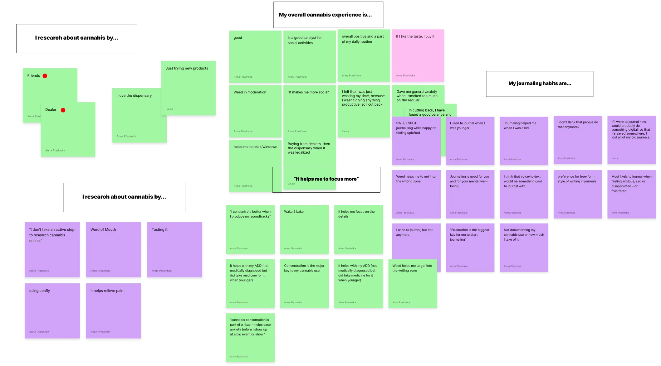
We got a total of 61 responses for the online survey, and we were sure to apply journalistic practices and eliminate any internalised bias when asking the questions. Up to 26.7% say that they’ve had negative experiences when consuming cannabis, and 45.9% of respondents said that they don’t track the products they use.
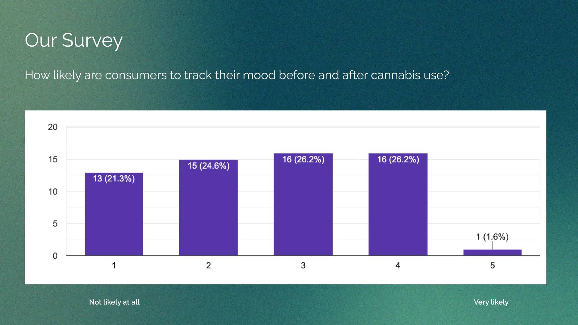
We also found that there was an almost even split between respondents and how likely they are to track their mood before and after cannabis use.
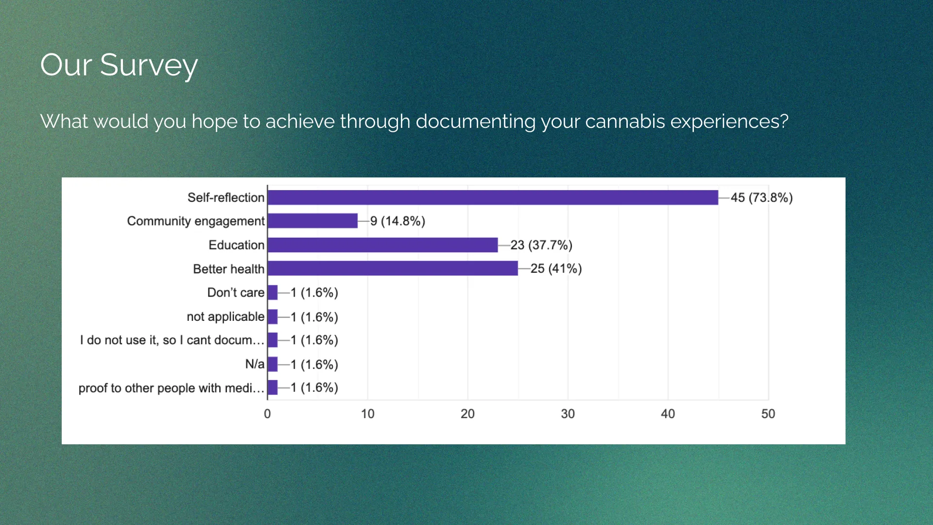
A great insight for us though, was to see that most cannabis user were hoping to achieve self-reflection, education and better health from their cannabis consumption.
We then did 5 interviews to validate our survey findings, asking questions like:
Here are some of the answers:
Once we consolidated our findings, we then conducted a competitor analysis to see which features would be most beneficial for us to explore for our app. We identified the next steps from the survey results, too, in order to know what to do next. These steps were as follows:
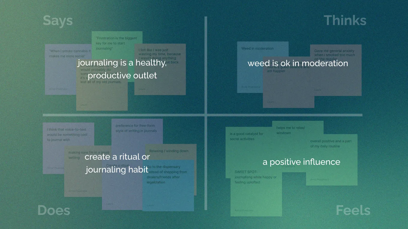
Our primary and secondary research gave us insight into what our problem statement could be for users. Our empathy map findings were grouped into four categories: what the users say, what they think, what they do and how they feel.
This led us to the following problem statement:

By creating a clear problem statement, we were able to find the root of the problem for the centre of the project. We now knew the problem we were solving, which gave us enough information to create our user persona. A user persona defines the person and their activities in order to identify key pain points for them when using cannabis and trying to feel less anxious. This was important and key to designing a product that would sell on the market.

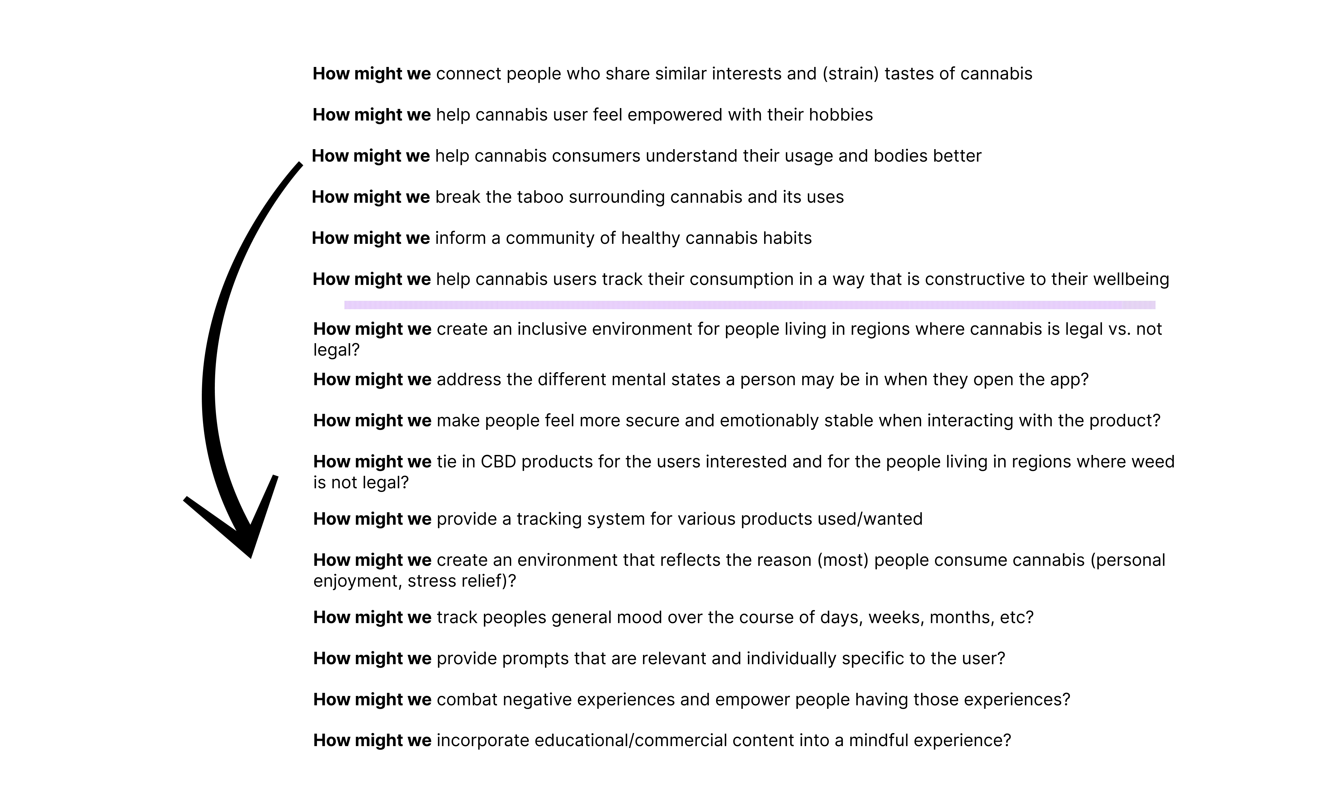
The user persona, along with the problem statement, gave us good direction on which problems we need to focus on and prioritise for our MVP. Laura and I met and put together a list of How Might We’s (HMW) — a methodology to reframe our insights to find opportunities and innovate on problems when we continued with our research throughout the product design. According to the Nielsen Norman Group, in an article by Maria Rosala, “constructing how-might-we questions generates creative solutions while keeping teams focused on the right problems to solve.” As mentioned before, our research did not take a chronological approach, but we kept going back to the research, checking our problem statement and ensuring that we focused our efforts on solving the right problem.
Here you can see some of the HMWs:
To reach our goals, and to also differentiate ourselves from the market, we discovered that we need to ensure that:

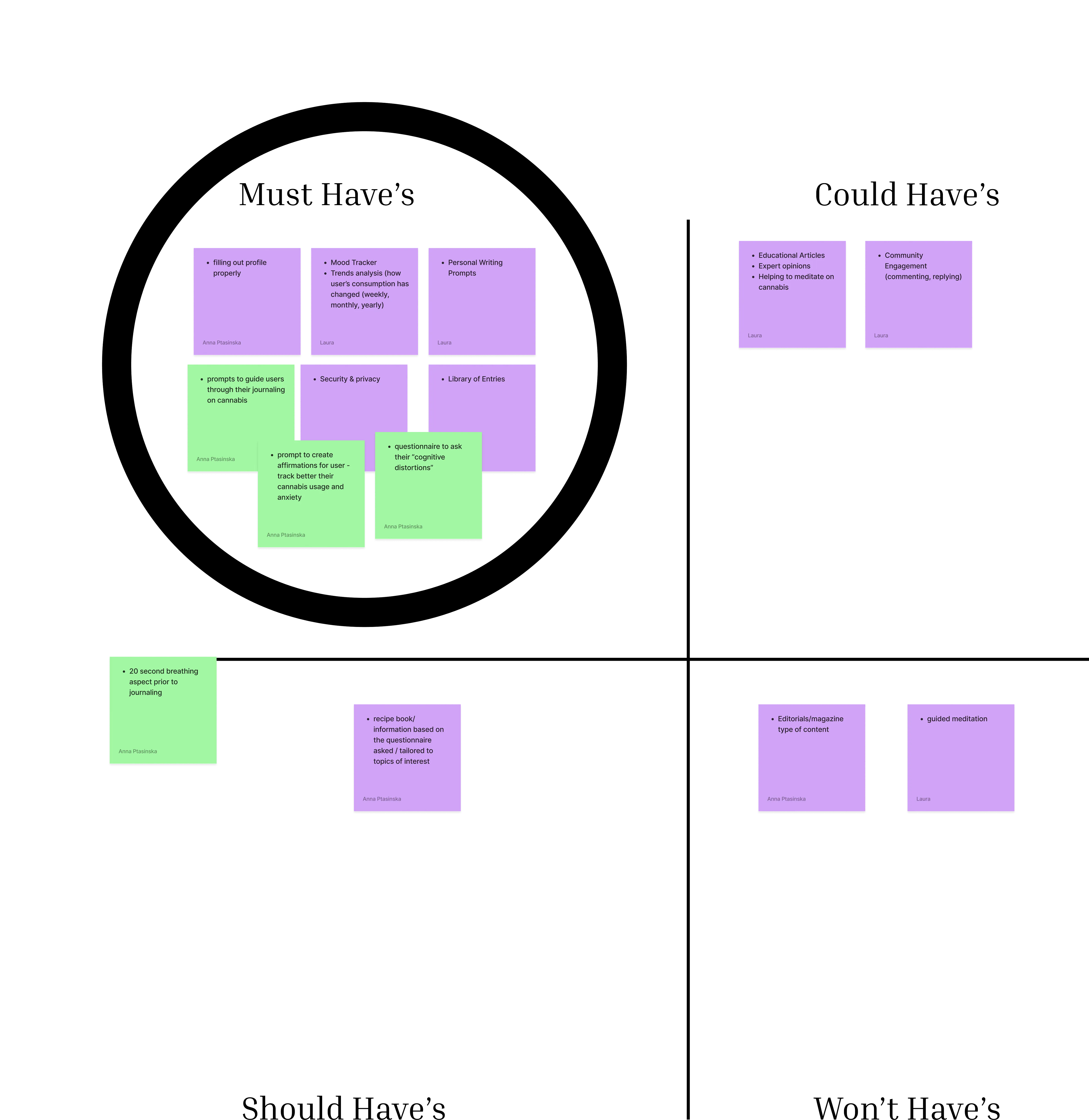
At this point in the project, we needed to be able to answer our initial problem statement with the designs that we were about to create. Every design decision referred back to this initial problem for our discovery stage. Using the Eisenhower Matrix, it was a comprehensible way to ensure we stayed on track and created a user flow that answered the problem statement and worked for our MVP within our given timeframe when designing each element for the app.
We identified that key features that the Bluntly app needed to have was a mood tracker, trend analysis data to track how users’ consumption has changed on weekly, monthly, or yearly basis, personal writing prompts, security & privacy and a library of entries. As you can see in the diagram below, there were other features that we wanted to incorporate like guided meditation, breathing exercises, community engagement (to find people in your area to discuss/share their cannabis experiences), a cannabis editorial magazine (data-driven) to give scientific articles on how cannabis use could improve mental wellbeing if consumed correctly.
For more information on how the Eisenhower Matrix can help you prioritise your product design, development and tasks, see the video below.
But for now, back to Bluntly ☺
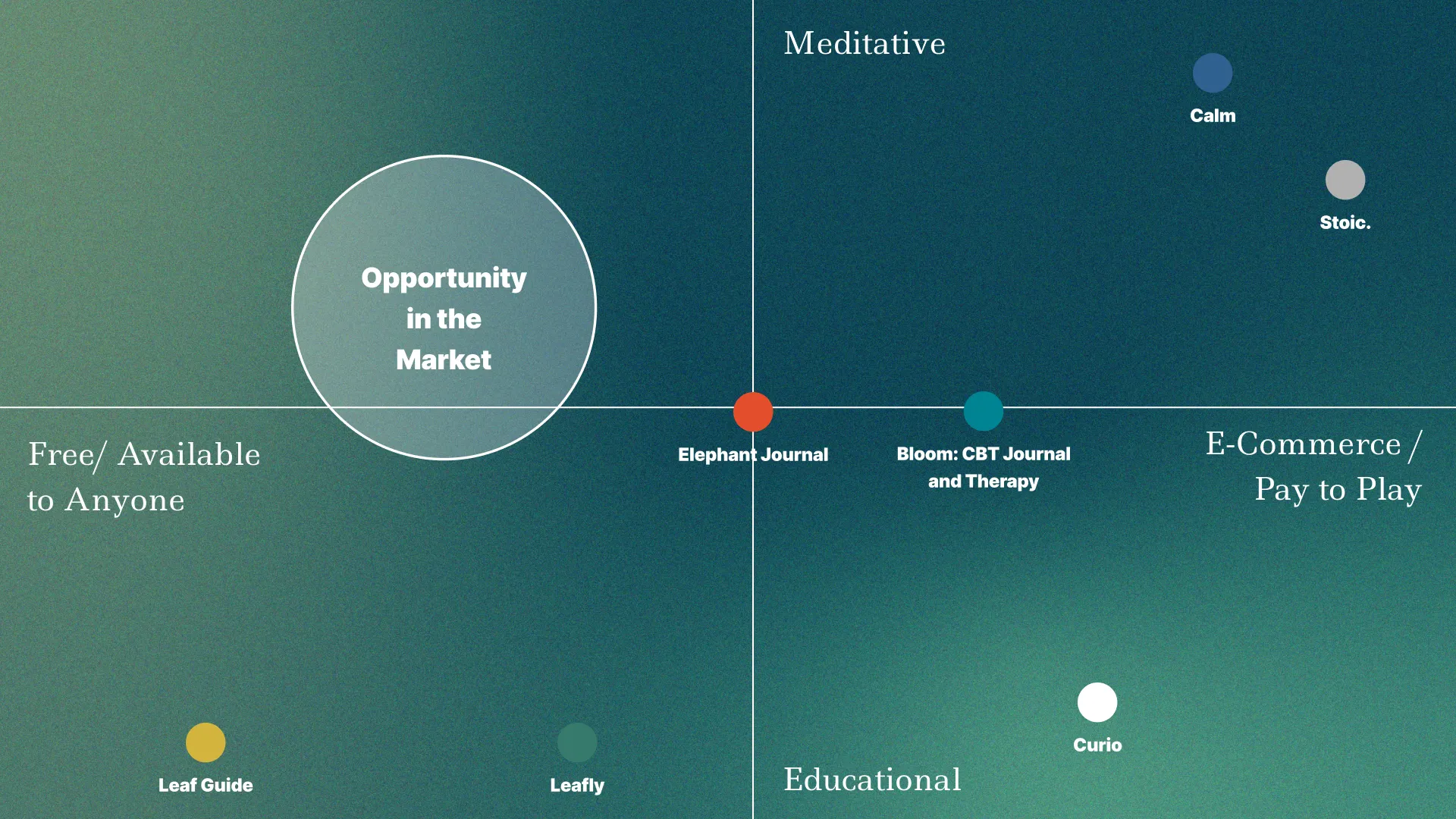
After determining the most important features to design, we returned to review our competitor set. Laura and I did a visual competitor analysis to define what our unique selling point would be and which brand attributes would speak to our target users in a unique way. While most of our competitors offered (both guided and unguided) meditation and journaling, we found that the cannabis apps tracking were review-based and didn’t give way for users to express their consumption and journaling habits in one app. Most apps that were helpful, and with good reviews, for meditation and journaling — like Stoic or Calm — were pay-to-play applications. Therefore, our opportunity in the market is for the app to be free and available to anyone who wants to use it, and be meditative instead, or educational.
Interaction design helps us to show that we know our stuff. Luckily Laura is a designer by profession so it was insightful to see how her ‘designer-eye’ kept track of the important features we needed to design.
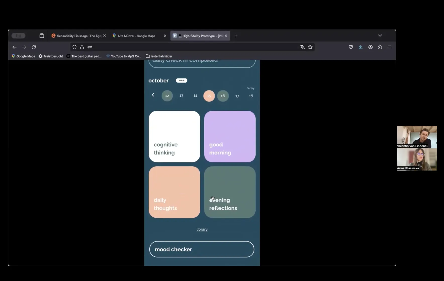
Our sketch proposes that we would like to offer guided and unguided journaling, but for the sake of the MVP, we decided to focus on the guided journaling features and voice-to-text as the most important way for our users to interact with the app when journaling. The mood tracker feature was readily available as soon as the user opened the app to track how cannabis affects their moods, and they were prompted to answer if they had consumed cannabis before using the application, along with the mood tracking question.
A journal library was available for users to achieve their mindful state of self-reflection — and insight obtained from our survey: “What would you hope to achieve through documenting your cannabis experiences?”
We wanted to incorporate this so people can go back to their journal entries and reflect on how their cannabis consumption (i.e. strain, smoking, eating, oils etc), dosages and how certain strain consumption made them feel. Most journal entries consisted of tags for easier findability and aligned with the prompts that they had chosen to guide their journaling for that day. This data was then presented in a mood-tracker graph that compared the data from previous journal entries in previous months. A calendar was also incorporated so that each journal entry was easily available. Journaling habits are also displayed so that users can track when they are, the times of day, and the prompts that they are most accustomed to.
Our solution aimed to help cannabis users with cognitive thinking exercises, anxiety & stress relief, as well as disarm any negative magnifications that might occur once they have/have not consumed cannabis. In summary, we wanted our users to trust the app and feel at ease when journaling — seeing it as a constructive exercise.
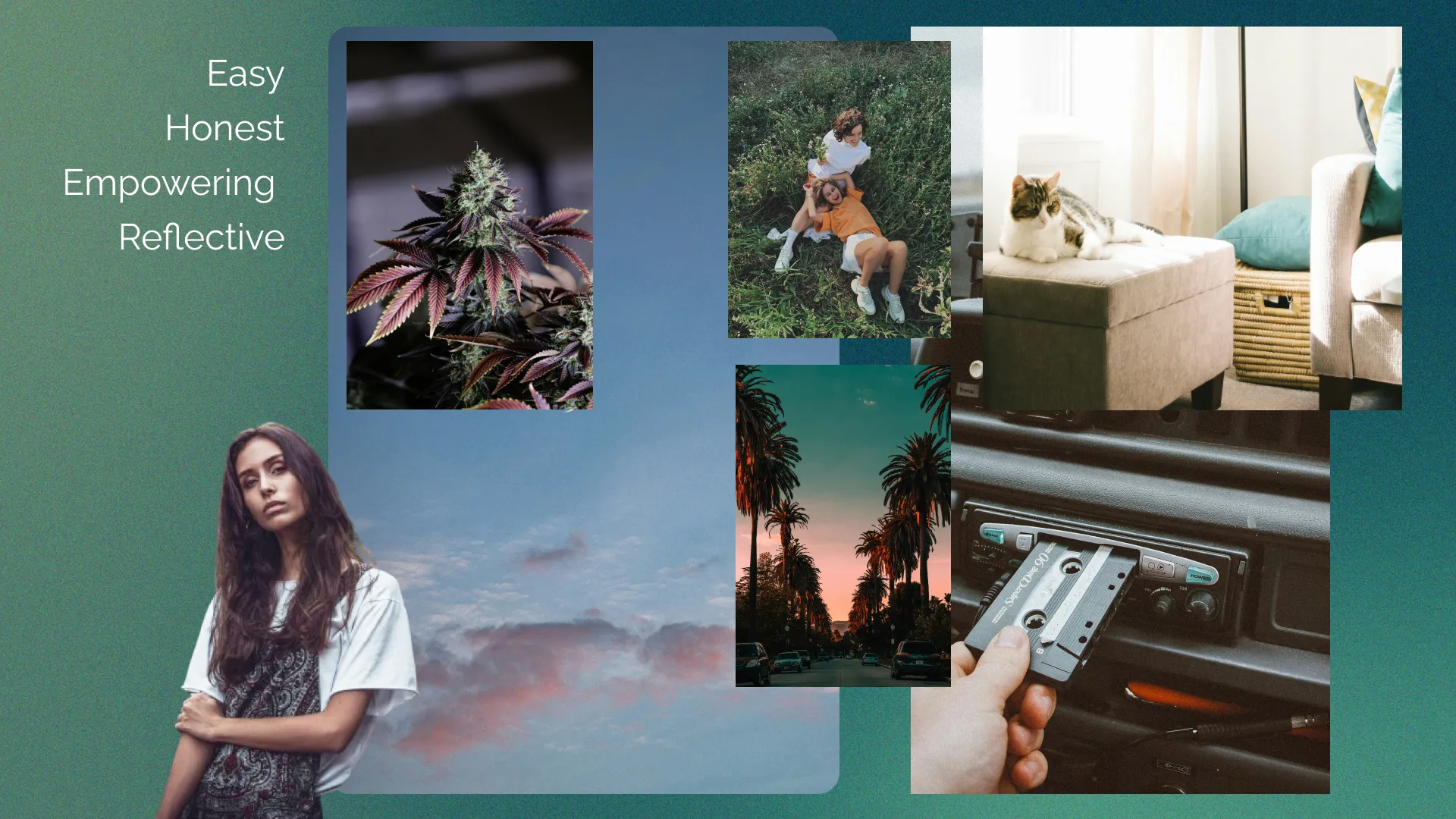
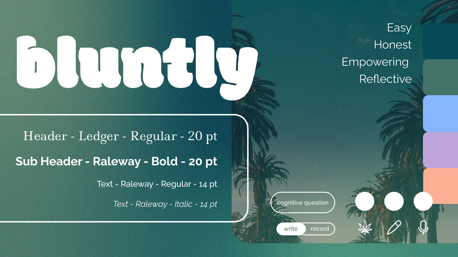
To consolidate the user flow with one brand identity, we created a style tile that answered our brand attributes and highlighted our USP (unique selling point) in the market. We wanted our app to uphold easy, honest, empowering and reflective characteristics. We chose a colour palette that helped evoke emotions of calmness, focus and ease. Buttons with smooth and organic corner radii added to the easy-going attitude of the app. We also researched which fonts are most helpful for people to feel less anxious when reading and helped them calmly retain knowledge and focus whilst remaining calm. We chose a combination of serif and sans-serif fonts of Ledger and Raleway to showcase this research. Below you will find a mood board and style tile which encompasses these characteristics and research:
Finally, at this part of the project, the app started to take shape and form. We created a UI kit that aligned with our style tile and applied it to the design of mid-fi and high-fidelity wireframes.
I’ve attached a walkthrough video of the hi-fi prototype to include give you an understanding of how the user flow has come together with our design elements.
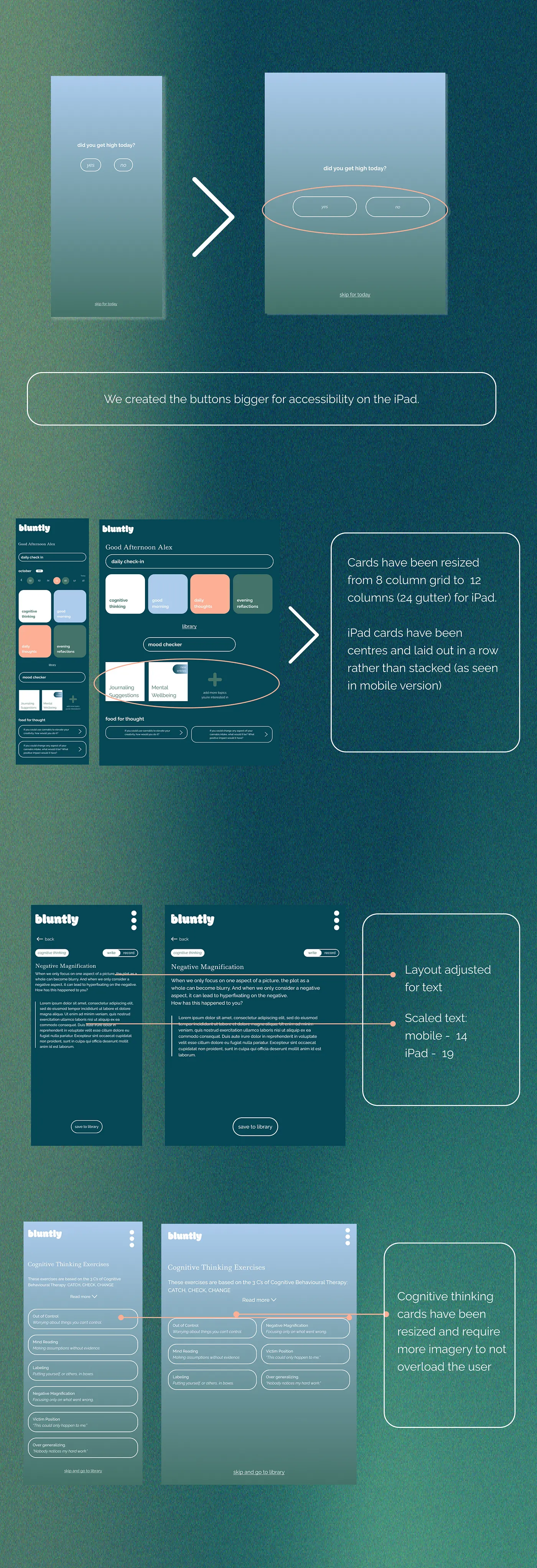
This was a challenging but fun project to work on. Due to the sensitivity of mental health, we had to take proper care to ensure that our information was scientifically factual. We had some trouble reaching the 100-respondent benchmark for the survey during our research phase, but we managed to get above 50. Also, I encountered a learning curve on Figma with auto layout, components and variant designs. After some guidance from Laura, the designer, on the team, I applied the feedback in our responsive designs for iPad, I understood the importance of layout on different screens.
Due to time constraints, we could only fit in a usability test after the design of the hi-fidelity prototype, but that was okay because we managed to obtain great feedback to ensure we knew how to proceed with the development and next steps for the MVP.
We did two usability tests on our MVP prototype. Yann and Valentin were kind enough to give constructive feedback on specific elements and features. Here are some examples:

The first user, Yann, gave the following feedback:

Another concern for Yann was that the tracking could trigger negative emotions for the users if they hadn’t done it everyday
Our second usability test participant, Valentin gave us similar feedback.
Other results from the user testing showed us that:
We decided to design for mobile users as it is easier for the designs to scale-up that way. We also considered that due to the nature of the app, with it’s journaling feature and most cannabis users consuming in social settings, it would be best to do the responsive design for iPads. Below I have included the designs to showcase the components that we resized for the iPad app.